Background
😄 Hi, you are probably directed here because of my recent tweet. To practice my data visualization skills, I decided to enter the this week’s #TidyTuesday challenge, which is about how different media franchises stack up with their revenue streams. You can read more about the dataset here.
#TidyTuesday I made an interactive treemap for revenue by category using treemap and d3treeR. #rstats pic.twitter.com/plRYgXSNs2
— Zhi Yang, PhD (@zhiiiyang) July 3, 2019
Data visualization
library(dplyr)
library(ggplot2)
library(d3treeR)
library(treemap)
library(RColorBrewer)
library(stringr)

dat <- read.csv("https://raw.githubusercontent.com/rfordatascience/tidytuesday/master/data/2019/2019-07-02/media_franchises.csv")

head(dat, 3)
## franchise revenue_category revenue
## 1 A Song of Ice and Fire / Game of Thrones Book sales 0.900
## 2 A Song of Ice and Fire / Game of Thrones Box Office 0.001
## 3 A Song of Ice and Fire / Game of Thrones Home Video/Entertainment 0.280
## year_created original_media creators
## 1 1996 Novel George R. R. Martin
## 2 1996 Novel George R. R. Martin
## 3 1996 Novel George R. R. Martin
## owners
## 1 Random House WarnerMedia (AT&T)
## 2 Random House WarnerMedia (AT&T)
## 3 Random House WarnerMedia (AT&T)dat2 <- dat[!duplicated(dat), ]
dat2 %>% group_by(revenue_category) %>% summarise(n())## # A tibble: 8 x 2
## revenue_category `n()`
## <fct> <int>
## 1 Book sales 7
## 2 Box Office 76
## 3 Comic or Manga 27
## 4 Home Video/Entertainment 64
## 5 Merchandise, Licensing & Retail 73
## 6 Music 12
## 7 TV 11
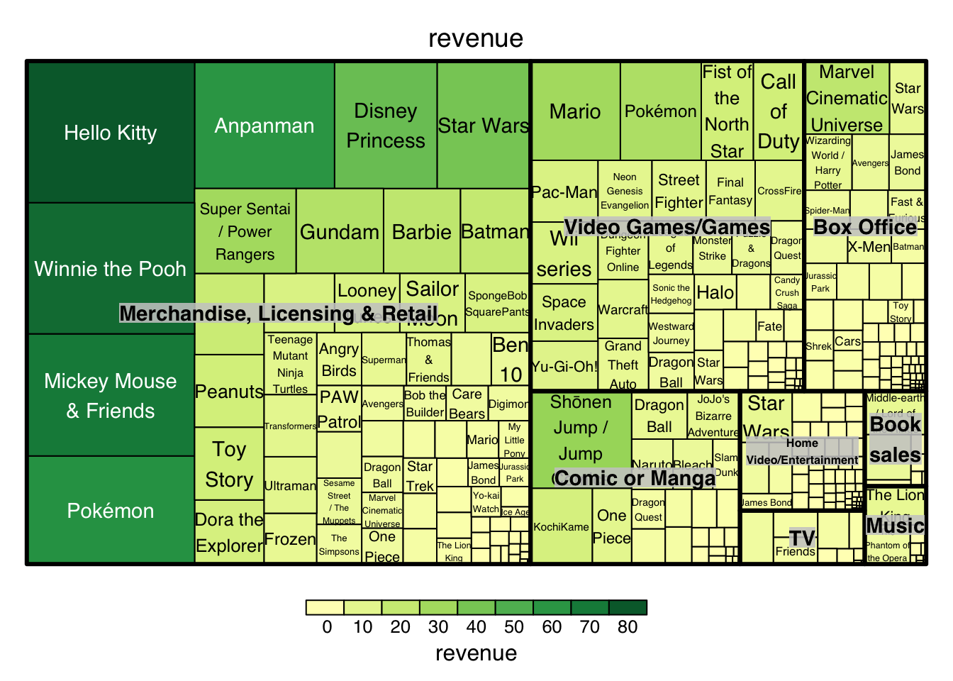
## 8 Video Games/Games 51By briefly looking at the data, I realized that it has several categorical variables, one of which might have too many distinct levels. Therefore, using the traditional barplot might not be a good idea here unless only a subset of the data is shown here. So, it occurred to me that the treemap might be a good idea. So far, treemap is very handy and straightforward to use compared to other similar R packages.
treemap(
   dat2,
   index=c("revenue_category", "franchise"),
   vSize="revenue",
   vColor="revenue",
   type="value",
)
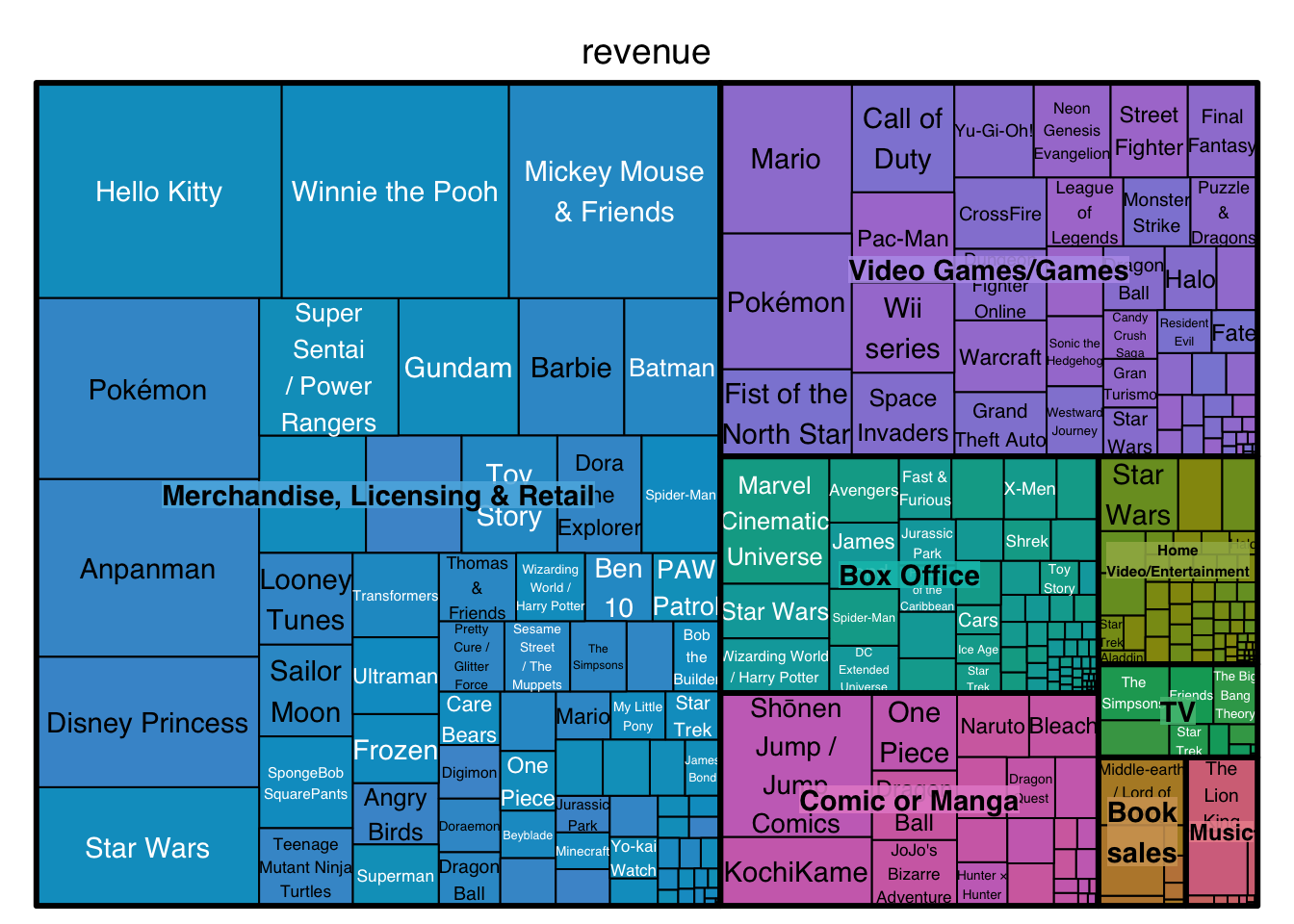
Basically, you can get a very pretty treemap with a few line of codes. However, it doesn’t really differentiate each revenue category. Wouldn’t it be nice that each revenue category gets its own color that changes along with revenue? Intuitively, it doesn’t seem a difficult task to implement. But the answer is not trivial!
treemap(
   dat2,
   index=c("revenue_category", "franchise"),
   vSize="revenue",
   vColor="revenue",
   type="index",
)
If I changed type argument to be index, it seems that every category has its own color but the color doesn’t coordinate well with the revenue change. I also gained nothing by going through the source codes of treemap packages. If someone knows how the color changes with this setting, PLEASE LET ME KNOW! So, I am going to show you a chunk of not that elegant event a little bit daunting codes.
dat3 <- dat2 %>% arrange(revenue_category, revenue)  %>%
  group_by(revenue_category) %>%
  mutate(bin = cut(revenue,
                   breaks = c(-Inf,
                              quantile(revenue,
                                       probs = seq(0.25, 0.75, 0.25)),
                              Inf),
                   labels = c(1, 2, 3, 4)))

dat3$newbin <- with(dat3, interaction(revenue_category,  bin))

dat3$newbin <- factor(dat3$newbin, as.character(unique(dat3$newbin)))

dat3 %>% group_by(revenue_category, bin) %>% select(newbin)
## Adding missing grouping variables: `revenue_category`, `bin`## # A tibble: 321 x 3
## # Groups: revenue_category, bin [31]
## revenue_category bin newbin
## <fct> <fct> <fct>
## 1 Book sales 1 Book sales.1
## 2 Book sales 1 Book sales.1
## 3 Book sales 2 Book sales.2
## 4 Book sales 2 Book sales.2
## 5 Book sales 2 Book sales.2
## 6 Book sales 4 Book sales.4
## 7 Book sales 4 Book sales.4
## 8 Box Office 1 Box Office.1
## 9 Box Office 1 Box Office.1
## 10 Box Office 1 Box Office.1
## # … with 311 more rowscounts <- dat3 %>% group_by(revenue_category) %>%
summarise(n = n_distinct(bin)) %>% pull(n)## `summarise()` ungrouping output (override with `.groups` argument)palette <- sapply(1:n_distinct(dat3$revenue_category),
function(i) brewer.pal(counts[i], c("Greys", "Reds", "Oranges",
"RdYlBu", "Blues", "Purples", "PuRd", "Greens")[i])) %>%
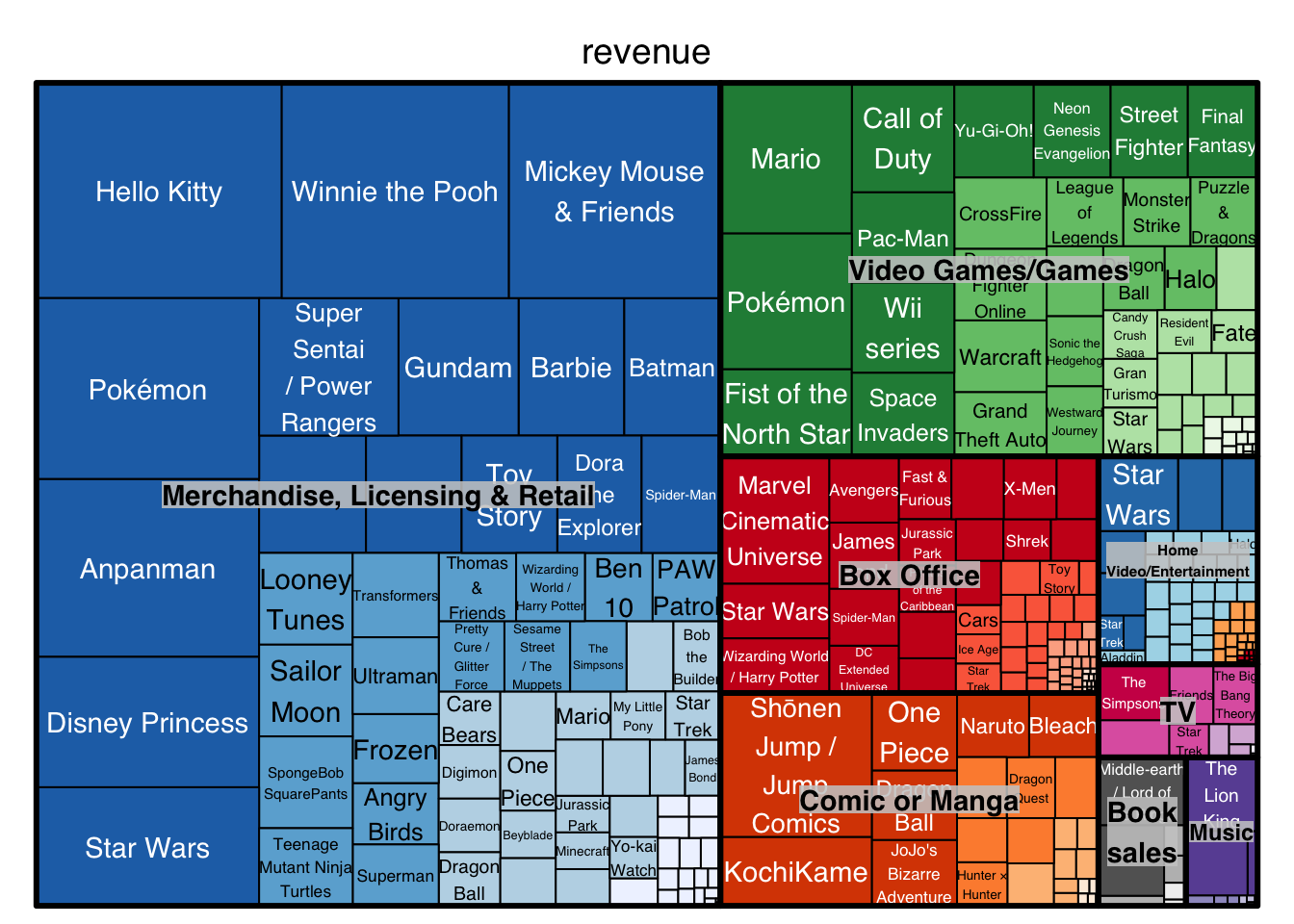
unlist()Basically, we have to manually create a factor variable, bin, that categorizes the revenue by each category. Then, we combine bin and revenue_category to be a new factor variable, newbin, which is assigned with different color accordingly.
tree <- treemap(
   dat3,
   index=c("revenue_category", "franchise"),
   vSize="revenue",
   vColor="newbin",
   type="categorical",
   position.legend  ="none",
   palette = palette
)
Looks exactly what we wanted! You think it is one step away from making it into an interactive map? Nooooooo!
Interactive treemap
Apparently, d3tree function from the d3treeR package doesn’t take in any unusual characters like & or ō. Please don’t ask me how I found out. Therefore, we need to replace this two characters with something compatible with d3tree.
dat3$franchise <- str_replace_all(dat3$franchise, "[&]", "and")
dat3 <- dat3 %>%
   mutate(franchise =
            ifelse(is.na(str_match(franchise, "Jump Comics"))==FALSE,
                   "ohonen Jump / Jump Comics", franchise))

dat3$revenue_category <- factor(dat3$revenue_category)

dat3$revenue_category <- recode(dat3$revenue_category,
      `Merchandise, Licensing & Retail` = "Merchandise, Licensing and Retail")
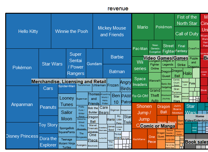
Now, we are finally ready for making the interactive map. Simply copying the code from treemap into d3tree.
treenew <- treemap(
   dat3,
   index=c("revenue_category", "franchise"),
   vSize="revenue",
   vColor="newbin",
   type="categorical",
   position.legend  ="none",
   palette = palette
)
d3tree(treenew, rootname = "Revenue by category")If you’d like to change the font size or style, please source this function style_widget from link.
style_widget <- function(hw=NULL, style="", addl_selector="") {
  stopifnot(!is.null(hw), inherits(hw, "htmlwidget"))

  # use current id of htmlwidget if already specified
  elementId <- hw$elementId
  if(is.null(elementId)) {
    # borrow htmlwidgets unique id creator
    elementId <- sprintf(
      'htmlwidget-%s',
      htmlwidgets:::createWidgetId()
    )
    hw$elementId <- elementId
  }

  htmlwidgets::prependContent(
    hw,
    htmltools::tags$style(
      sprintf(
        "#%s %s {%s}",
        elementId,
        addl_selector,
        style
      )
    )
  )
}
Currently, you can choose from three kinds of styles from d3tree, d3tree2, d3tree3.
style_widget(
  d3tree(treenew, rootname = "Revenue by category"),
  addl_selector="text",
  style="font-family:cursive; font-size:10px;"
)
style_widget(
d3tree2(treenew, rootname = "Revenue by category"),
addl_selector="text",
style="font-family:cursive; font-size:10px;"
)style_widget(
d3tree3(treenew, rootname = "Revenue by category"),
addl_selector="text",
style="font-family:cursive; font-size:10px;"
)I also have some news to share with you. Someone saw my last tweet of treemaps and reached out to me for a position at a healthcare consulting company. And I evetually got to the point that they would like to consider me for that position.
My #rstats friends, can you believe that I got a job interview and possibly an offer because I made this treemap for #TidyTuesday?
— Zhi Yang, PhD (@zhiiiyang) October 18, 2019
You never know who is watching you till you get calls from those who would like hire you. Keep up the good work and share with us! https://t.co/bdI0zJ5vjJ
