Background
I worked for Jessica Barrington-Trimis (@Doctor_BT) on a project to look into the effect of e-cigarette use on cigarette use among adolescents. After we submitted the manuscript, Jessica suggested me presenting the results at the upcoming 2019 Meeting – College on Problems of Drug Dependence, San Antonio, TX. Meanwhile, she sent me a video link about transforming the current poster style. After watching it, I was totally down to get the new poster rolling. If you haven’t heard about it, you can read through the story written by NPR. And, you can also follow the updates by using the hashtag #betterposter.
Excited to present the research work with @Doctor_BT at #CPDD19 on the effect of e-cigarette use on past 30-day cigarette use among adolescents. Thank you all for dropping by and asking amazing questions. Also, I’d to share my experience of adopting #betterposter by @mikemorrison pic.twitter.com/N4zt7y6Kh9
— Zhi Yang, PhD (@zhiiiyang) June 17, 2019
New poster
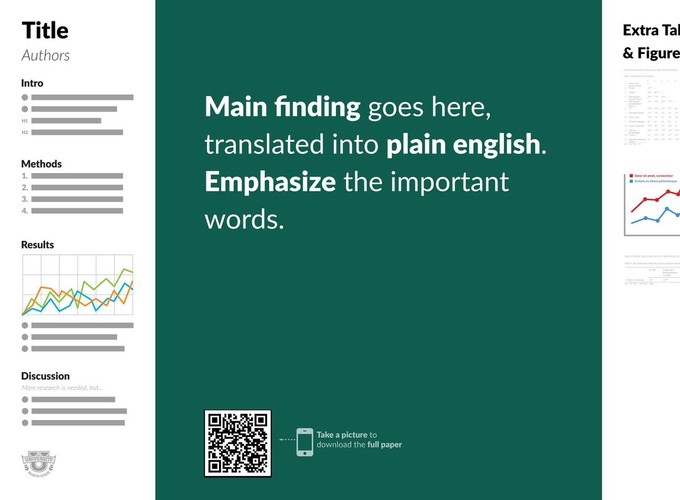
So, basically, my takeaway from this new trending way of making poster is that you just print one or two sentences at the top or in the middle with super large font size. What’s even better is that some genius already created an R package, posterdown, that allow R users to come up with a poster using R Markdown.

Is that amazing? You don’t have to spend hours adjusting the alignments and sizes of texts and pictures. Everything can be just controlled by changing a number or argument in R Markdown. From now on, you can focus on the contents rather than tedious PPT work.
At the conference
I ordered my poster online and had it delivered to the hotel. I was one of the few people who had the poster set up at the conference room at the day before. Apparently, I was a little bit worried about how the second day was going to turn out to be. My concerns were gone at the second day because I was too busy talking to peoples who stopped by to ask me questions about my poster. Here is what it looks like with me standing by it.

During two-hour time span, I had talked to ~ 30 people, of which ten of them took a picture of my poster. Five of them were even asking me how I made it. At first, I was wondering whether people were interested in my poster is because of the study itself or the new poster style. Then, I realized that the very first question that almost everyone asked is, what is a mod? Obviously, it has to do with them seeing the conclusion printed with large font sizes. Without it, I doubt a third of them will even stop by, not mentioning having a conversation with me. Judging by this point, I think the new poster style is a success.
Conclusion
If you are also interested in trying it out, you can check out the GitHub repo of my poster. I highly recommend trying it out for your next poster!
